Enhance your email communications with a professionally designed email signature. Contact us to create a customized email signature that showcases your brand’s professionalism and leaves a lasting impression.

The importance of a first impression is undeniable, but what about last impressions? Below, we show you the best email signature designs for your inspiration.
If you conduct business via email, the email signature you provide can be one of the final points of contact between your service and your customer.
An effective email signature contains your name, the company you work for, and your contact information. But remember that you don’t have to settle for a boring email signature design – here are some tips for eye-catching ones:
A common mistake people make with email signatures is to include too much information, which makes the signature appear bulky and long. This will discourage most people from looking at it, let alone reading it or clicking on your links.
Rather than including a phone number or links to social media profiles, try to keep your signature short and tailored to your brand. Do you avoid conducting business over the phone? Maybe nix the phone number from your signature? Are you very active on Twitter and Facebook? Consider including a link to those profiles instead!
Check out this simple and minimal email signature example. This design is kept short and simple by including only the most important pieces of information for the brand – the logo, email author’s name, job title, phone number and Skype username.

A commonly referenced technique for creating a color palette is “less is more”, or more specifically, “try to only use 23 colors”. This tip is especially true for your email signature design.
When you use too many colors, your designs can become distracting and unappealing. By limiting your palette and being intentional about what colors you use and when you use them, you can keep your design effective and looking good.
A good technique for selecting your color palette is to sample from any graphics that you are including, such as your brand logo.
Check out the example below:

We’ve established that you should keep your color palette small, but what about your font palette? You guessed it – keep that one small too. The same principle applies to fonts as it does to colors: using too many can quickly overwhelm your signature and make it difficult and distracting to read.
Another reason for people’s overuse of fonts is that they want to highlight certain titles and pieces of information, so they simply introduce a new font into the mix. A simple solution to this problem is to instead use a more flexible typeface.
Find a font with a range of weights and styles, such as Raleway. Mix up the size, weight, or color of the type when needed, rather than using a new font entirely. Finding these useful fonts is no hard task.
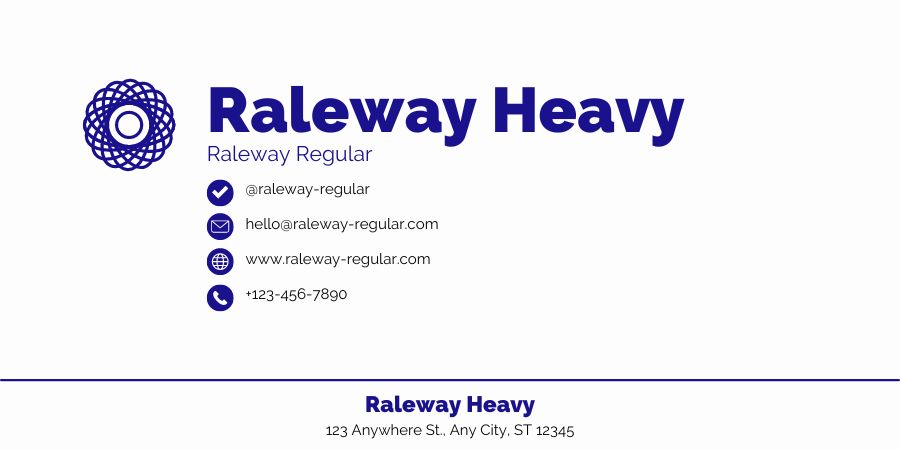
For any design that uses type to communicate important information, a strong hierarchy is necessary. Your email signature includes important information, so a strong hierarchy is particularly important there.
When designing your signature, use color, font size and weight to visually signal to your email recipients which elements of your signature they should read first. Perhaps it’s the email author’s name, or perhaps the brand/company name. Either way, be sure to put this key piece of type in the top hierarchical position. View an example below:
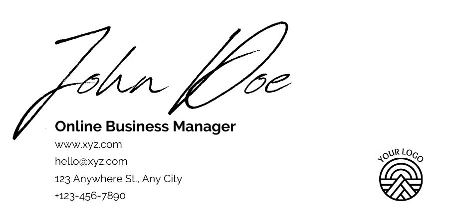
When designing an email signature, try to limit yourself to 1-2 graphics. Placing too many graphics in one email signature can overcomplicate your design and make it more like a collage than a sign-off.
A great way to represent your brand in email communications is to include a signature with your logo. This will help people know who sent the email and create greater recognition of your brand.
One of the most common graphic elements used in email signatures is a headshot of the author. Putting a face to a name makes it easier for recipients to connect with you and trust what you say – just be sure to use a well-lit, well-shot image that’s professional in appearance.

Make it easy for people to stay up-to-date on your latest content by including hyperlinked social media icons in your email signature. Including links to your social media pages not only drives traffic to your online content, but it also helps recipients find new avenues of contacting and following you.
If you’re interested in including links to your social media profiles, consider using icons rather than hyperlinks or URLs. Why? According to Neomam Studios, it only takes the human mind 150ms (microseconds) to process a symbol, and 100ms to attach meaning to it. That’s fast! Plus, icons save a lot of space and help you avoid clunky URLs.
An email signature is a small but important part of building your business, brand, and professional identity. It can provide recipients with valuable information and links as well as showcase your brand visually.
We make sure your type is legible, your colors are beautiful, and your graphics are scalable so that you’ll be able to leave a lasting impression on your contacts. Contact us now.
When it comes to achieving our clients’ goals, we stop at nothing. Our relentless pursuit of excellence drives us to explore new avenues, strategies, and technologies to stay ahead of the curve. We’re not content with the status quo; we continuously seek innovative solutions to help our clients thrive in the ever-evolving digital landscape.
Exploration is at the heart of our agency. We have an insatiable curiosity for the digital world, and we love to explore its vast and ever-changing landscape. Whether it’s diving into emerging trends, experimenting with cutting-edge tools, or analyzing data to uncover hidden insights, we are always eager to explore new possibilities and opportunities for our clients’ success.
In the fast-paced world of digital marketing, it’s easy to get overwhelmed. However, at Infinutus, we understand the importance of taking things step-by-step. We believe that a well-thought-out strategy, executed with precision, is the key to achieving long-term success. We break down complex challenges into manageable steps, ensuring that every aspect of your digital marketing campaign is meticulously planned and executed.
In a world filled with complexities, we believe in keeping things simple. Our approach to digital marketing is focused on clarity and transparency. We communicate with our clients in plain language, demystifying the intricacies of the digital landscape. We believe that simplicity is the key to building strong, lasting relationships with our clients.
At Infinutus, we are firm believers in the power of hard work and dedication. We understand that success in the digital realm is not a mere stroke of luck but rather the result of relentless effort and commitment. Our team of passionate professionals works tirelessly to ensure that our clients receive the best possible results. We don’t shy away from challenges; instead, we embrace them as opportunities to showcase our dedication to your success.
